
Expert creative solutions and comprehensive social media management have effectively driven brand awareness and quality patient acquisition. JGM are an absolute pleasure to work with and come highly recommended.


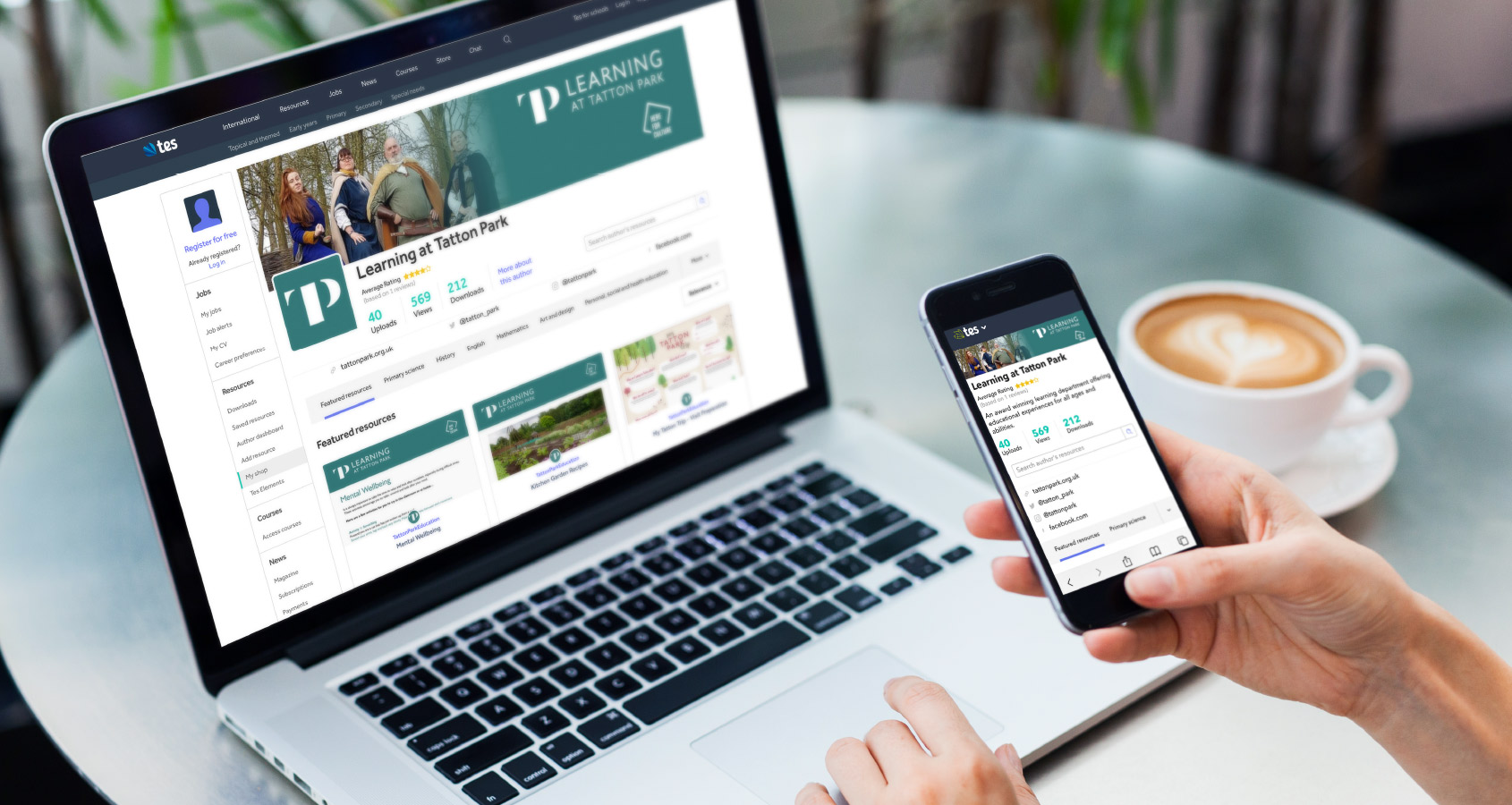
Tatton Park's award-winning education department had been awarded funding from Arts Council England (ACE) to help brand and promote their new and improved online learning provision.
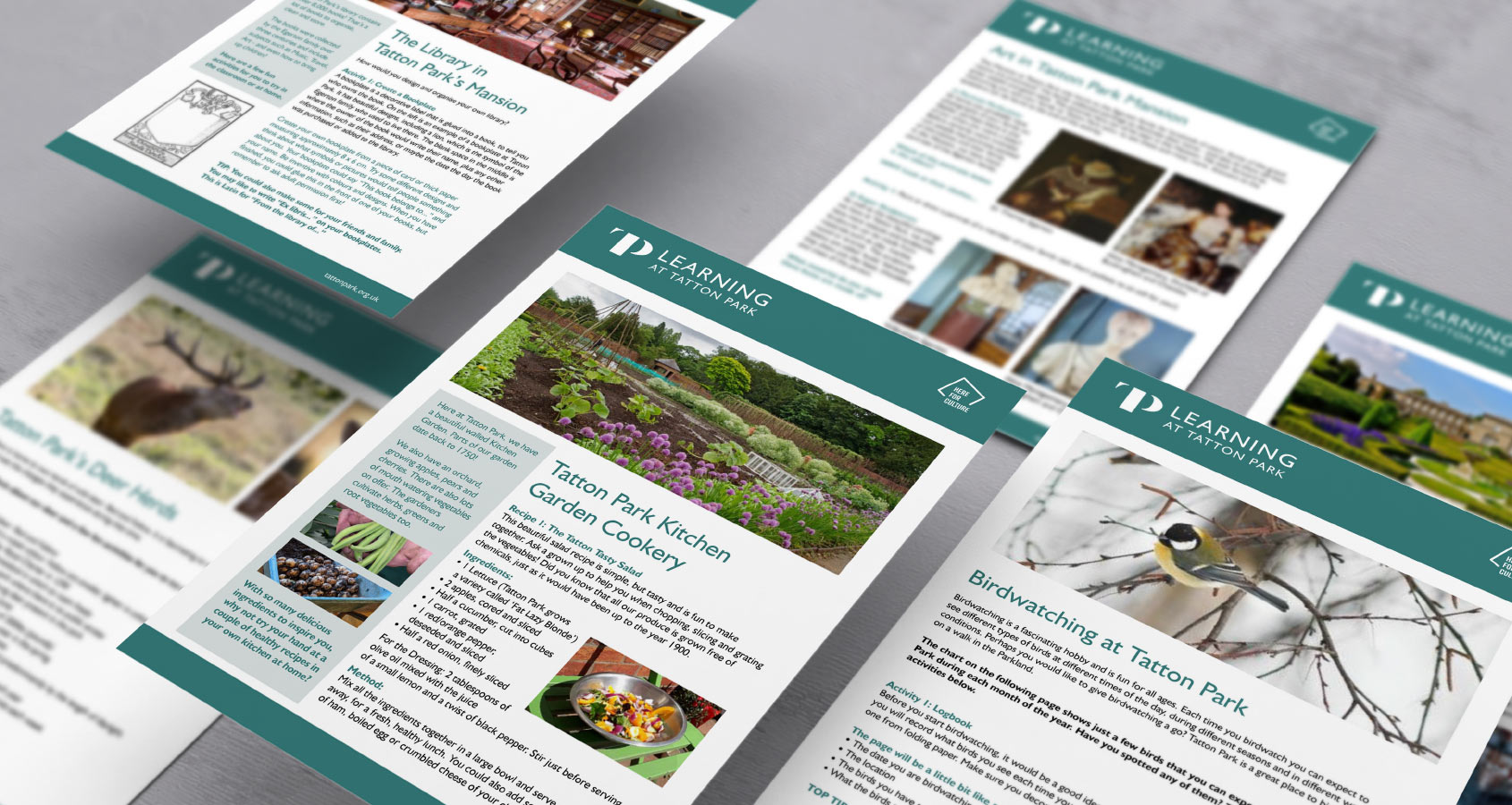
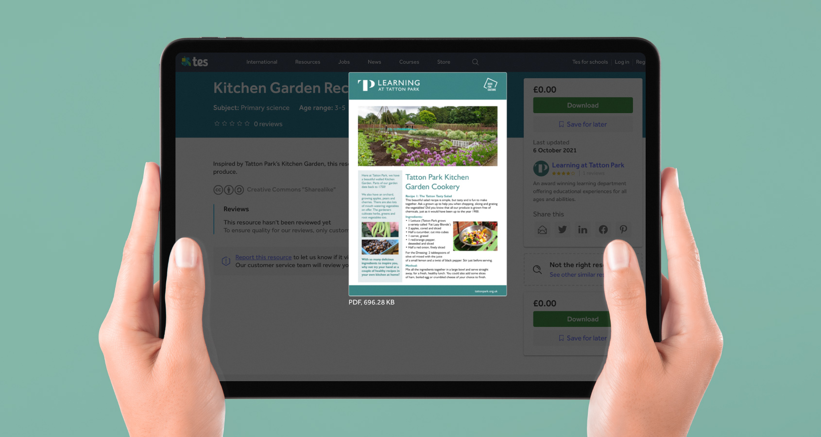
The new identity needed to be an extension of the new Tatton Park brand, yet differentiated in some way so not to confuse the relevant target audiences. As well as the Tatton Park learning identity, a design was required for the many downloadable pdf worksheets.
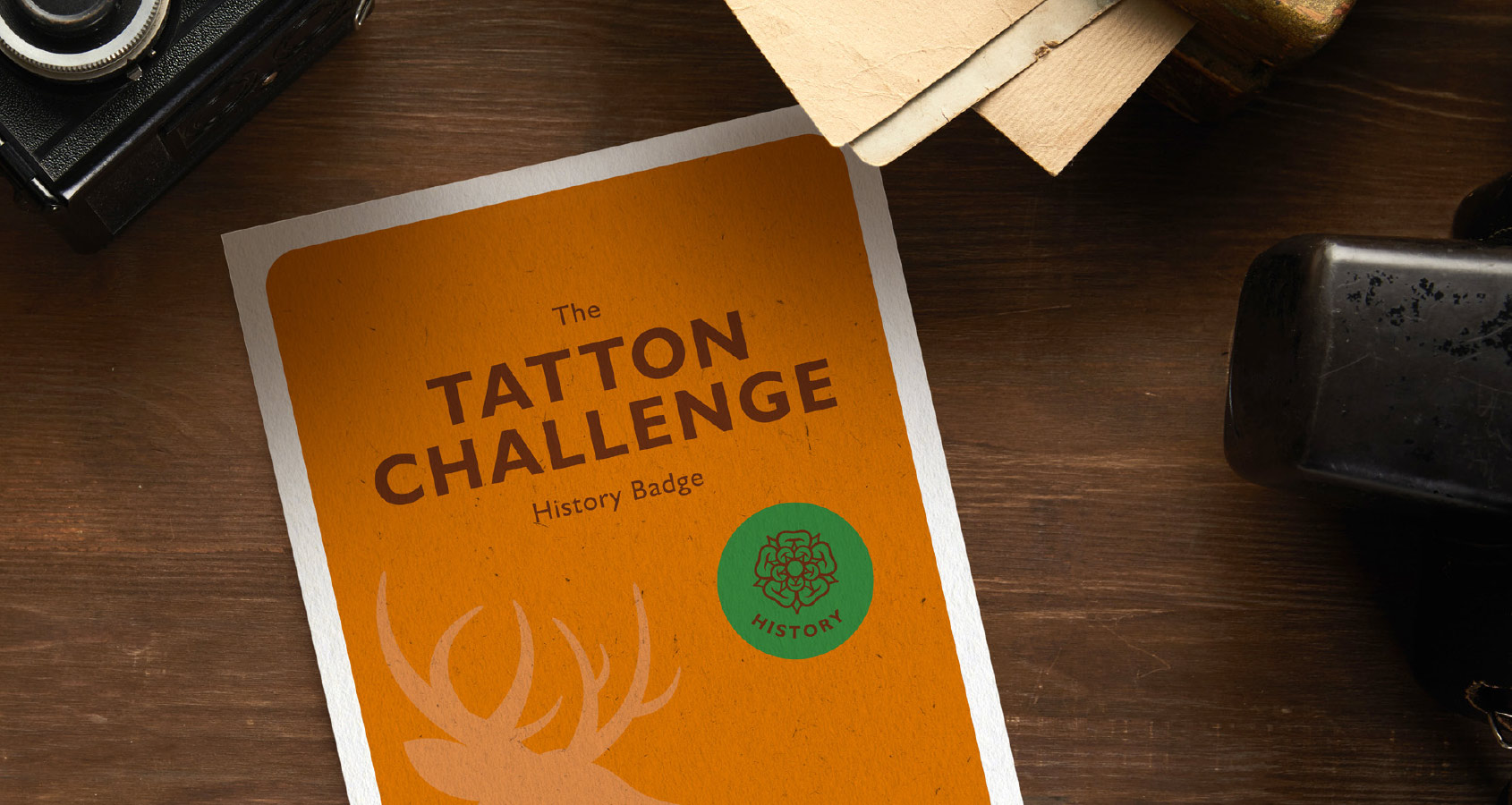
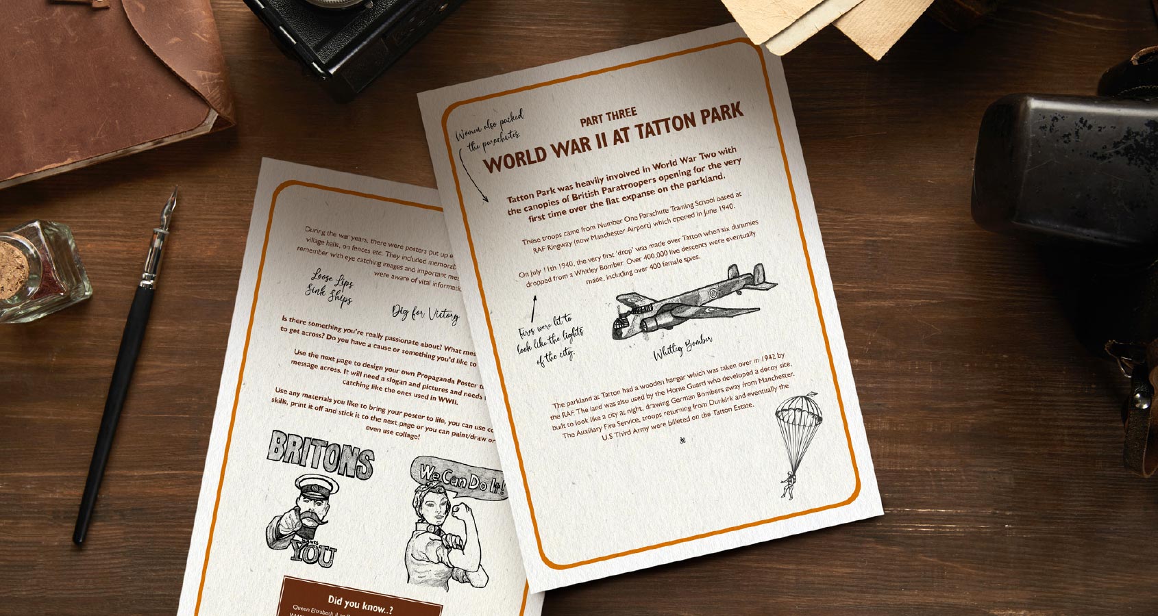
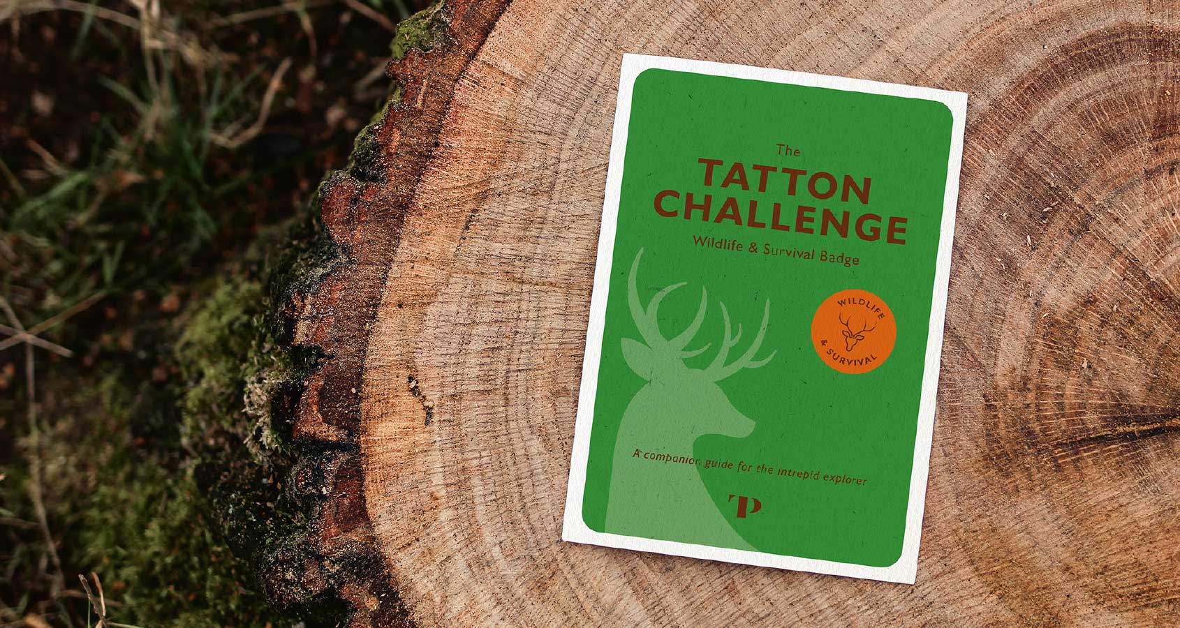
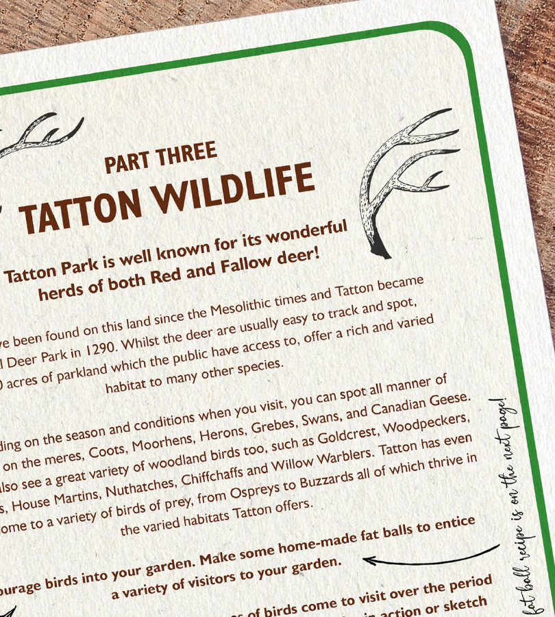
For the new logo we decided to keep the primary TP monogram as an integral part of the new learning identity. Using that style and adding the ‘Learning’ wordmark makes the new identity feel like part of the Tatton Park brand. The learning colour was chosen to help further differentiate the logo from the main brand. This complimentary green colour features prominently throughout the new worksheet templates. These have been designed in a way that delivers the educational content in a clear and branded style that is practical for those printing them out at home or school. This initial project has led to us designing and producing printed collateral for the Tatton Challenge.
Our department has never had investment of this type before and as such, no scope to create any assets of this quality. Everyone at JGM has been brilliant, and everything is looking superb.